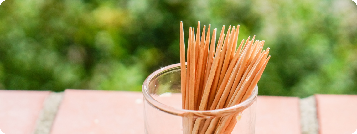
At first glance, a toothpick seems too simple to carry any design thinking. But its form and function tell a deeper story of usability, purpose, and thoughtful iteration.
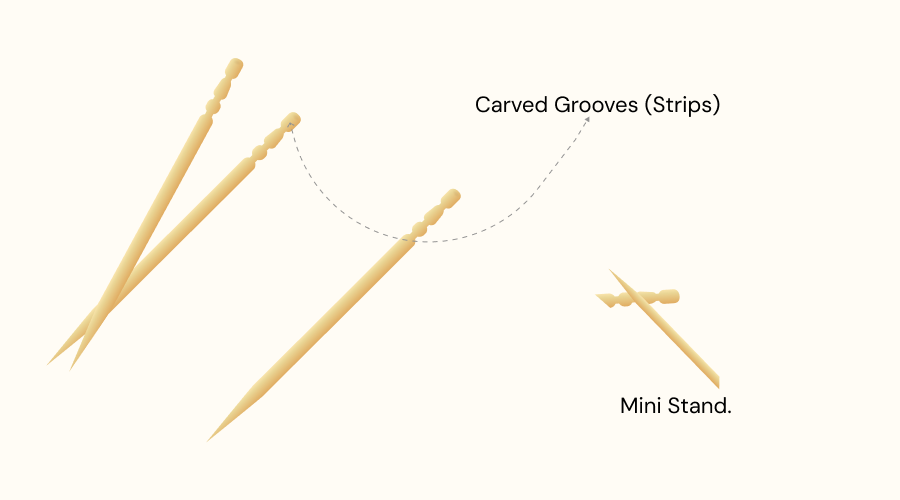
The classic toothpick has a smooth body with a few carved grooves (strips) near one end. These tiny details aren’t decorative — they improve grip, prevent slippage, and often mark the break point for easy disposal or for sharing hygienically. The grooves make it easier to pick up from a flat surface — a subtle, often unnoticed ergonomic touch.
The strips at the tail end are also designed to act as a stand — by breaking off the end and placing it on top, it keeps the used tip elevated, preventing it from touching the table or any surface.

Most clever micro-design decisions
The toothpick’s design has remained unchanged for decades because it achieves maximum function with minimum form. Its thin cylindrical shape easily reaches between teeth, and its pointed tip provides precision without excess effort. The geometry is timeless — no redesign has truly improved its efficiency.
Why the Strips Exist
Found a few “creative” toothpick designs — now I’m officially confused 😅
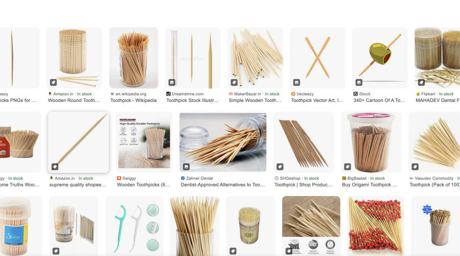
Source: Google images search
During research, I also found some other creative toothpick designs — from retractable versions to playful shapes — showing that even the simplest product can be redesigned in many ways. While these alternatives are interesting, the classic form remains timeless due to its simplicity and usability.
Researching the toothpick shows that even the simplest products embody thoughtful UX. As a digital UI/UX designer, this teaches that:
Disclaimer: If you’re thinking, “Did I just waste my time reading this f***ing toothpick saga?” — I promise I’m sorry 😅. But hey, even small things can teach big lessons!